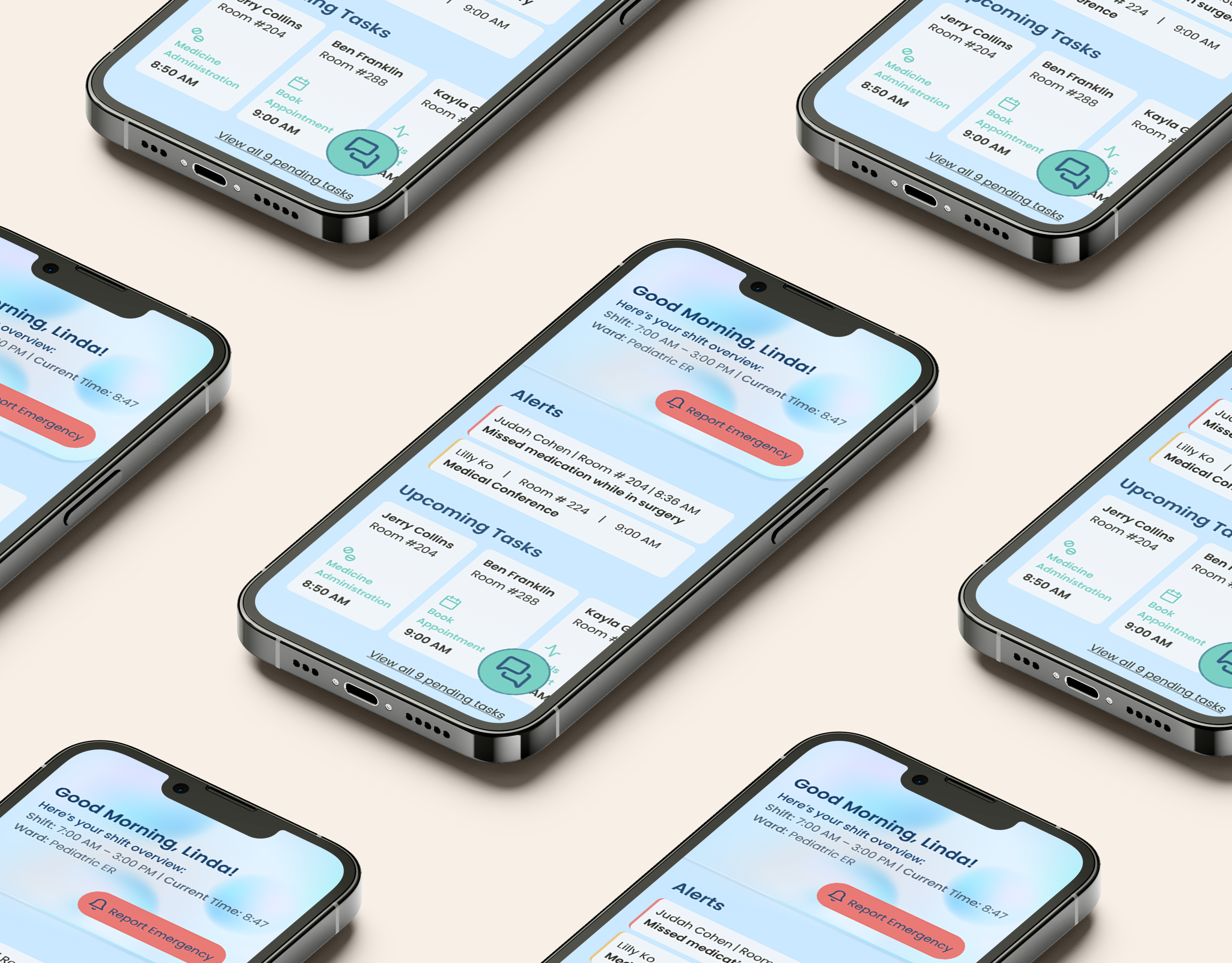
Nurssiree is a new one-of-a-kind application that assists hospital nurses in managing their time and responsibilities while on duty. Nurssiree’s goal is to enable nurses to efficiently and enthusiastically respond with a “yessiree” to all their tasks!
As the UX/ UI Designer for this project, I was tasked with creating a 2-part application to assist nurses in managing and effectively balancing their time and responsibilities while on call. Nurssiree includes both a mobile app for nurses on the floor, to help them manage patient care, as well as a desktop version to assist charge nurses and nurse supervisors to track both patient care and nurse performance.
Each part of the application had its own set of page requirements. The timeline for the project was 4 days in which to plan an outlined UX solution with basic UI screens depicting the implemented solutions.
Each part of the application had its own set of page requirements. The timeline for the project was 4 days in which to plan an outlined UX solution with basic UI screens depicting the implemented solutions.
Having defined the initial challenge, I proceeded to explore existing platforms to familiarize myself with the platform I was tasked to create. I discovered that similar platforms do exist but for the most part, they are geared towards caretaking agencies offering services beyond the hospital walls.
After compiling this information I created a Competitive Analysis summarizing my findings. This allowed me to understand what preexisting features do or don’t exist and where to best invest my efforts.
After compiling this information I created a Competitive Analysis summarizing my findings. This allowed me to understand what preexisting features do or don’t exist and where to best invest my efforts.
In addition to researching the platforms, I conducted User Research and spoke with potential users of the Nurssiree platform to better understand their goals and the current pain points within the pre-existent nursing management systems, again to better direct my efforts. After collecting this information I compiled a User Persona; a collection of data based on user research which serves to assist me in better understanding the client interest.
With the information gleaned from my research and interviews, I began to define the problem that my application was intended to solve. While similar applications exist for external caregivers, hospitals don’t yet have a centralized system where nurses and supervisors can manage their tasks, time, and responsibilities. In the hopes that my research had given me insight into the user’s goals and pain points, I moved on to outline the problem and potential solutions.
After completing the research for the application, I proceeded to define the problem.
Nurses are very busy throughout their shifts, monitoring patients, administering meds, receiving doctor's orders, and taking care of the overall well-being of their patients, as well as collaborating with doctors and other multidisciplinary members of the patient care team. As shifts change, there’s a lot of critical information that must be transmitted between team members. In addition, the actual time factor itself is essential, and all responsibilities must be discharged within a particular time frame or shift. That being said, understandably, things get lost in the shuffle as a result of breakdowns in communication or the fallout of time constraints leading to potentially dangerous consequences. The problem is exacerbated as there is no truly all-encompassing centralized system that is the repository for all the necessary information (updates/doctor’s orders etc.) and responsibilities and each individual nurse must synthesize all the data and information coming their way by their own methods with no real ability to track what was accomplished and what has been updated etc.
Nurses are very busy throughout their shifts, monitoring patients, administering meds, receiving doctor's orders, and taking care of the overall well-being of their patients, as well as collaborating with doctors and other multidisciplinary members of the patient care team. As shifts change, there’s a lot of critical information that must be transmitted between team members. In addition, the actual time factor itself is essential, and all responsibilities must be discharged within a particular time frame or shift. That being said, understandably, things get lost in the shuffle as a result of breakdowns in communication or the fallout of time constraints leading to potentially dangerous consequences. The problem is exacerbated as there is no truly all-encompassing centralized system that is the repository for all the necessary information (updates/doctor’s orders etc.) and responsibilities and each individual nurse must synthesize all the data and information coming their way by their own methods with no real ability to track what was accomplished and what has been updated etc.
Having defined the problem, I chose to utilize “How Might We Questions”, a targeted way of questioning the problem that yields a targeted answer that leads to solutions. In addition, I compiled a UX Strategy Diagram and with the two of them, a solution was formed.
How might we ensure that nurses are getting live updates regarding their patients?
How might we ensure a smooth transition between shifts so that no information slips between the cracks?
How might we assist the nurses in tracking and managing their tasks better?
How might we give the nurses a clear sense of their caseload for the upcoming shift?
Establishing what needs are to be addressed for this application, I proceeded to define what the brand voice would be. Defining this aspect assists me in staying true to the user’s goals.
Identified User Goals/Needs: *Better time management *Get live updates about patient care *See what patients they were assigned to *One central database *No crucial information should fall between the cracks
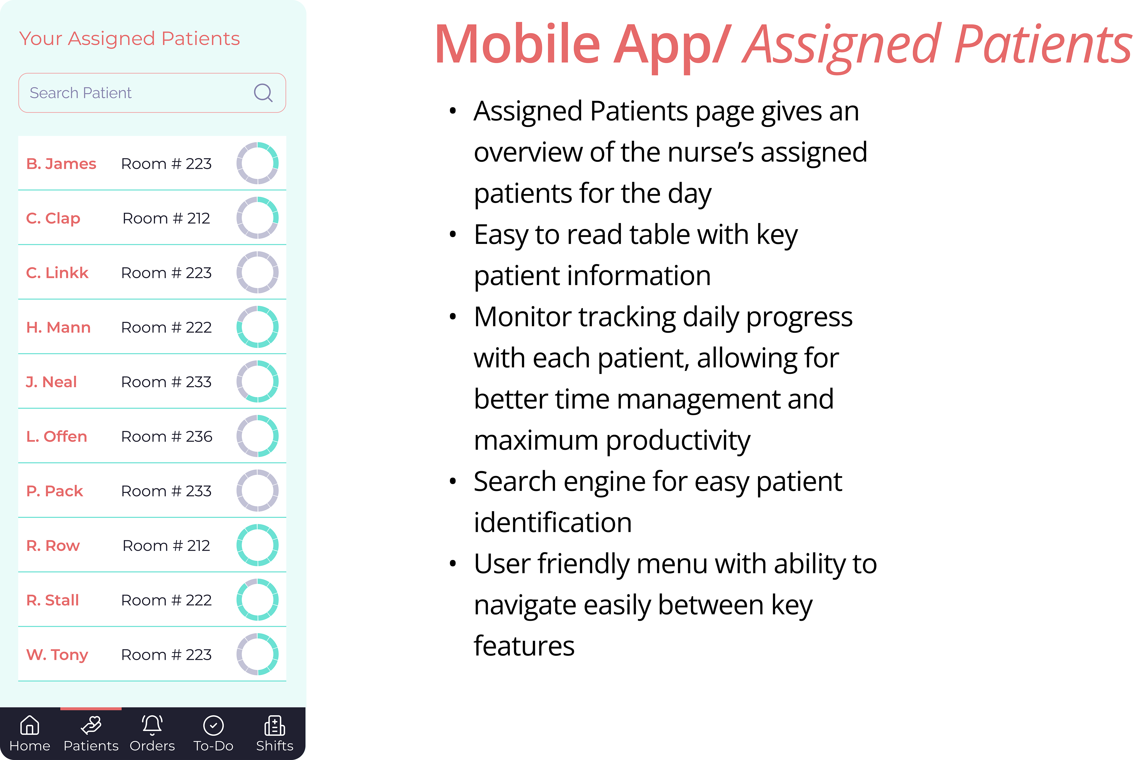
Create an app that shows assigned patients for the day- with a tracker to monitor what was accomplished
One database that when you update something it gets saved on file for the next assigned nurse
Alerts and updates when something changes regarding patient’s care
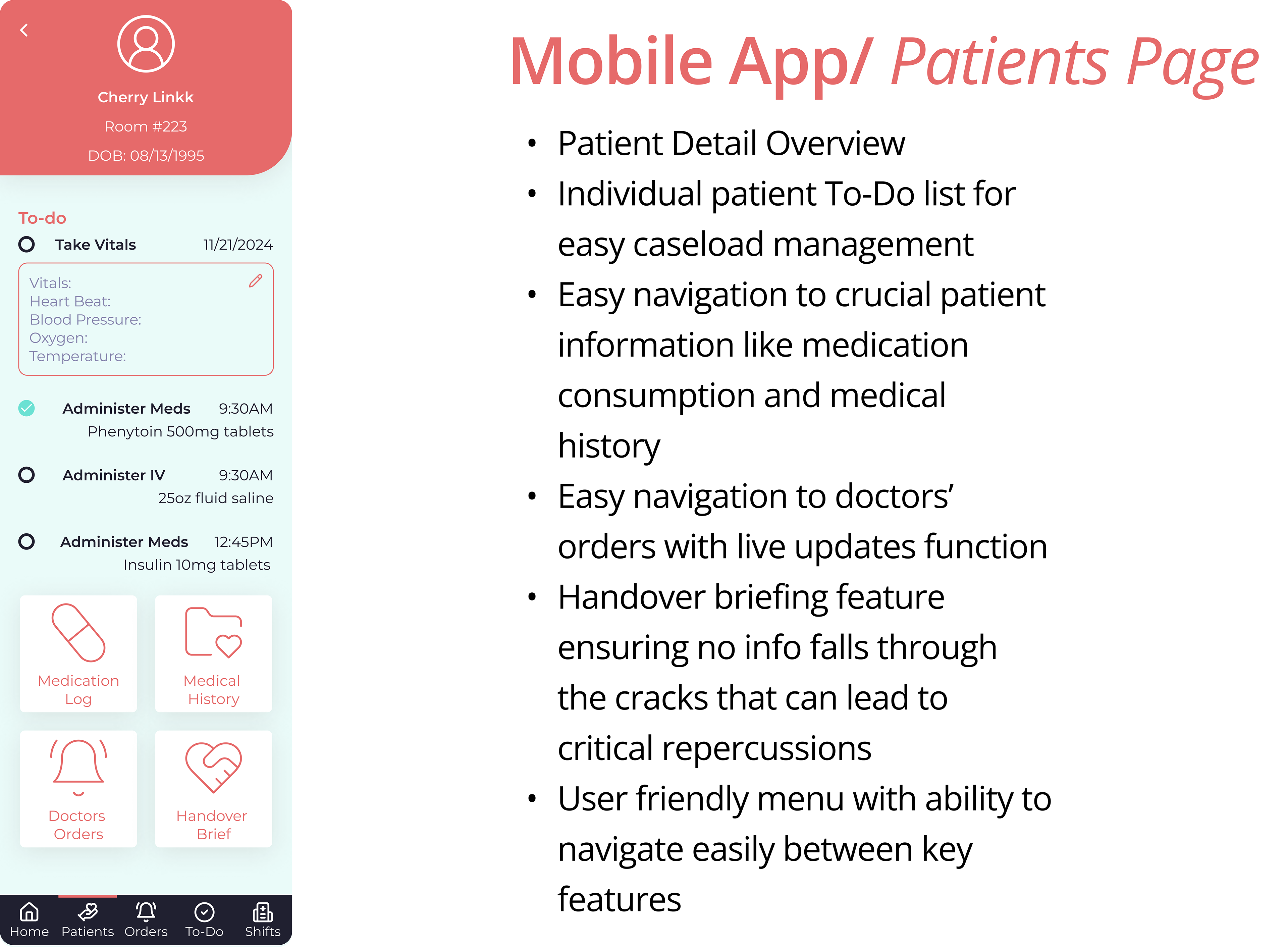
Create a summary for each patient that gets transferred to the next assigned nurse
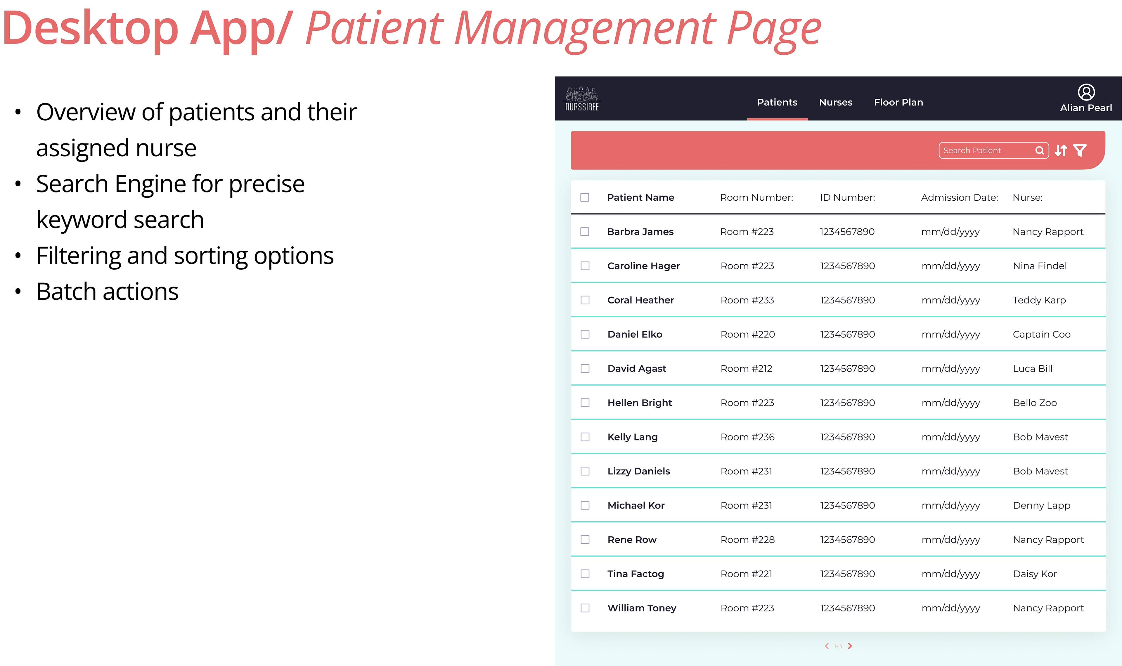
Desktop app that allows supervisors to see and track patients and nurses under their jurisdiction with live features based on user input
In the ideation stage, I started by working on my Information Architecture (IA) Diagram. My IA focused on organizing, structuring, and labeling the app in a general way- making sure to include all the key features mentioned. My IA map serves as a visual aid ensuring the user can easily navigate the app with all its features to its maximum capabilities.
Next, I focused on diagraming a common user flow paying attention to regular key actions. The User Flow mapped out specific common tasks in detail highlighting the key points; potential decision processes or pain points that may occur. In creating the user flow I brought forth my solutions to the problem presented to me.
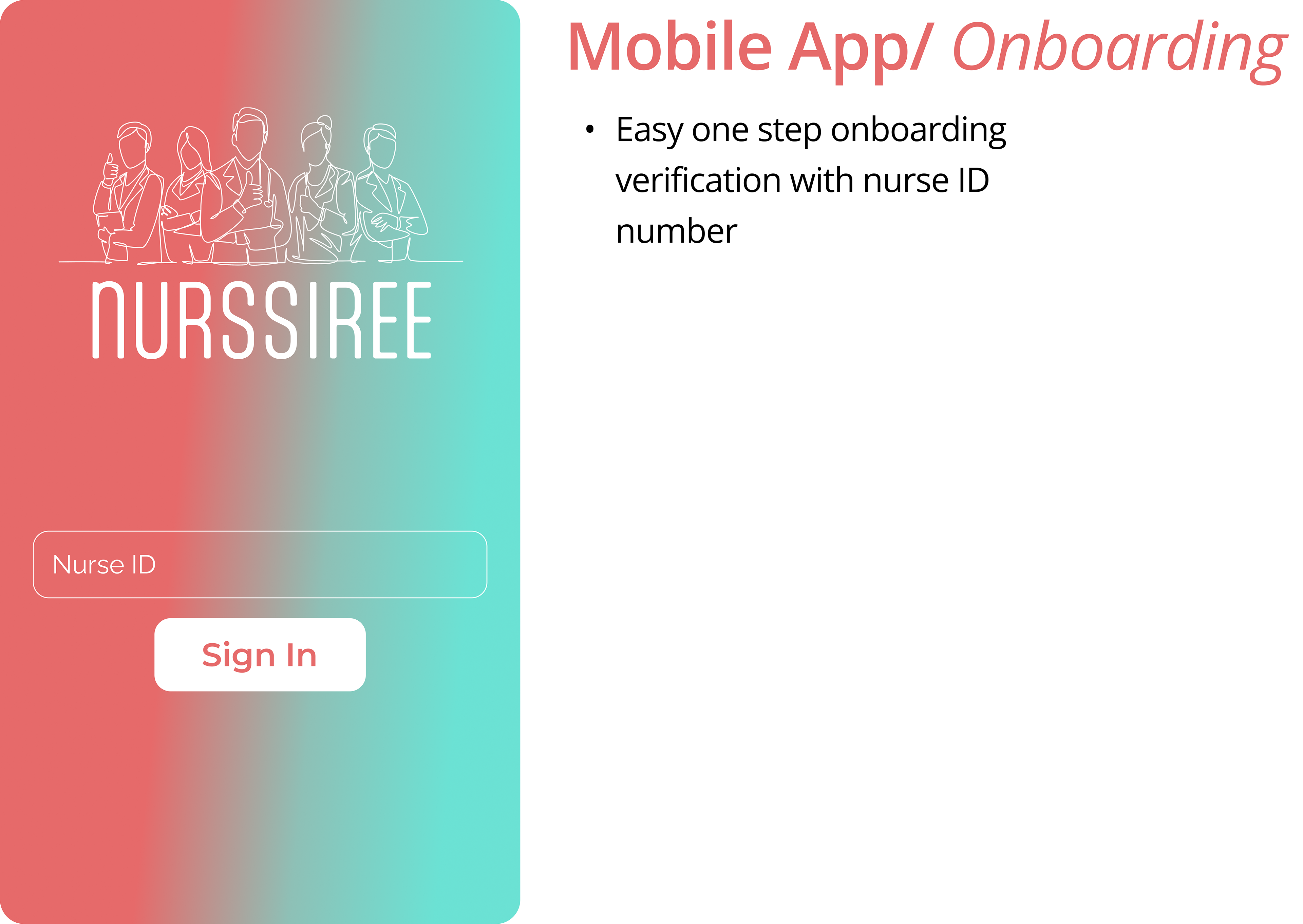
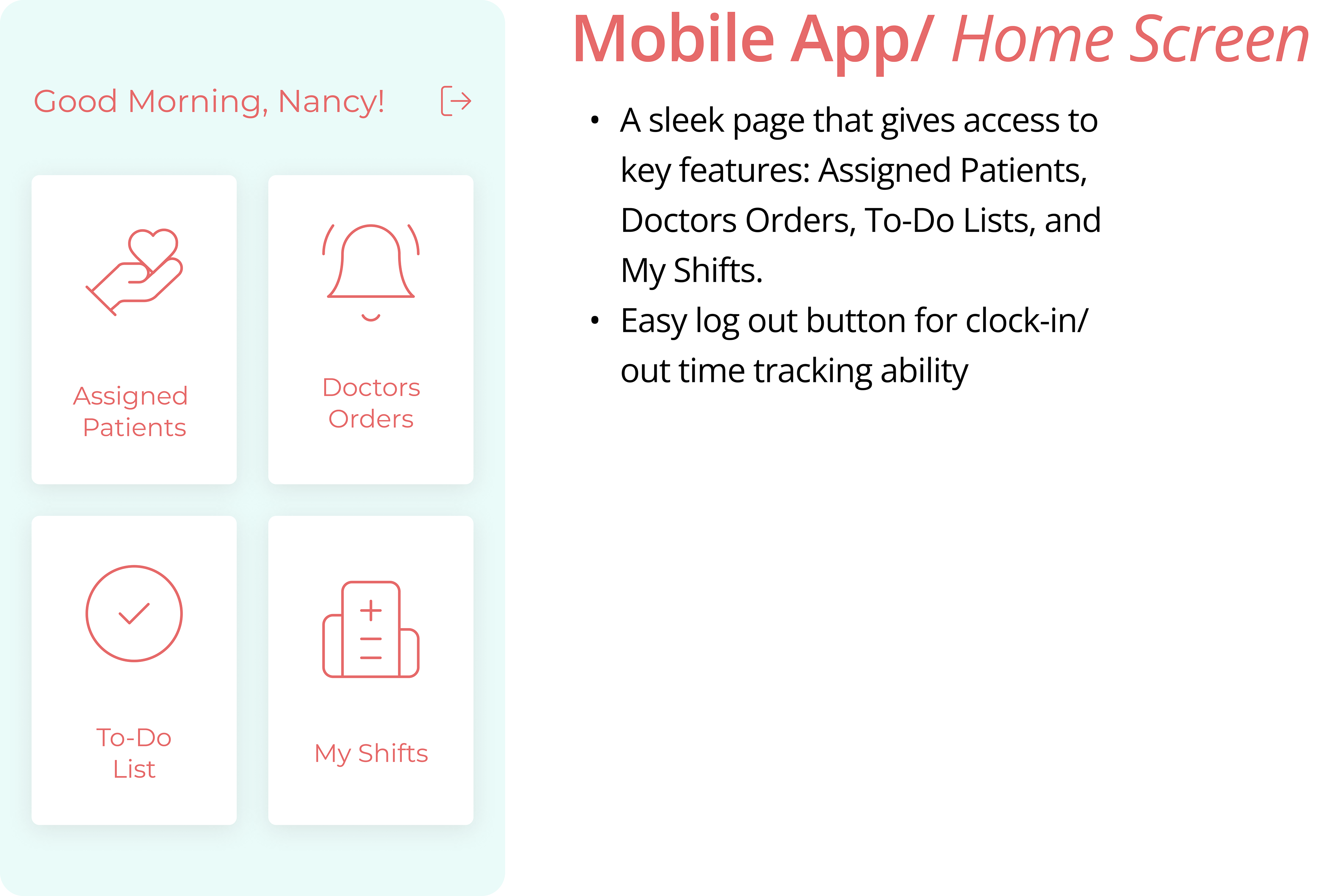
Having gotten a sense of the application I was going to build from a UX standpoint I began to think in design terms. I picked a reddish color as a primary color in addition to green, which is often associated with the medical field, as an accent color. In my design,I looked to create a visually pleasing page that is very simple and easy on the eye allowing the nurses to focus on their tasks without getting distracted by a cumbersome or distracting interface.
Mobile Screens
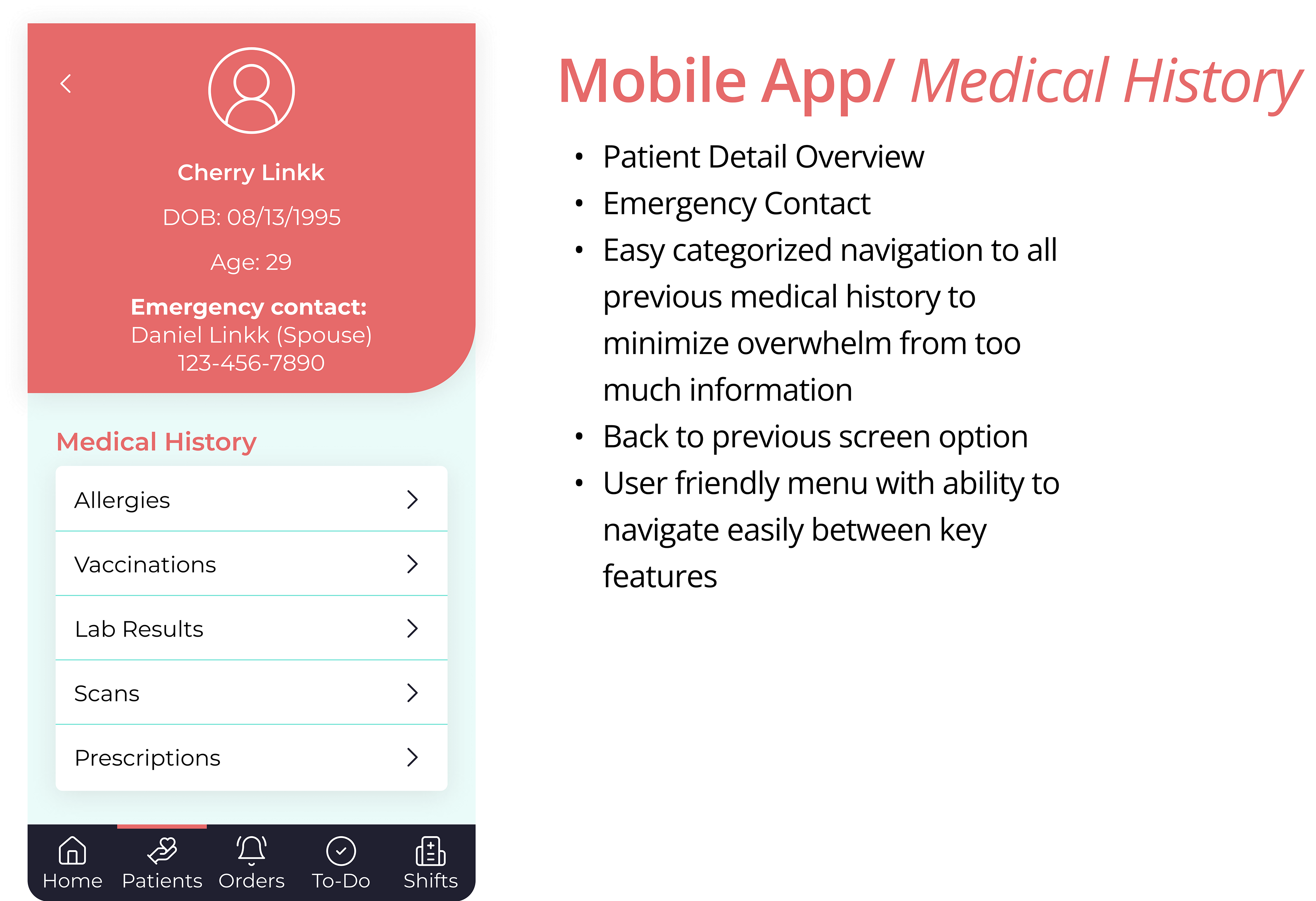
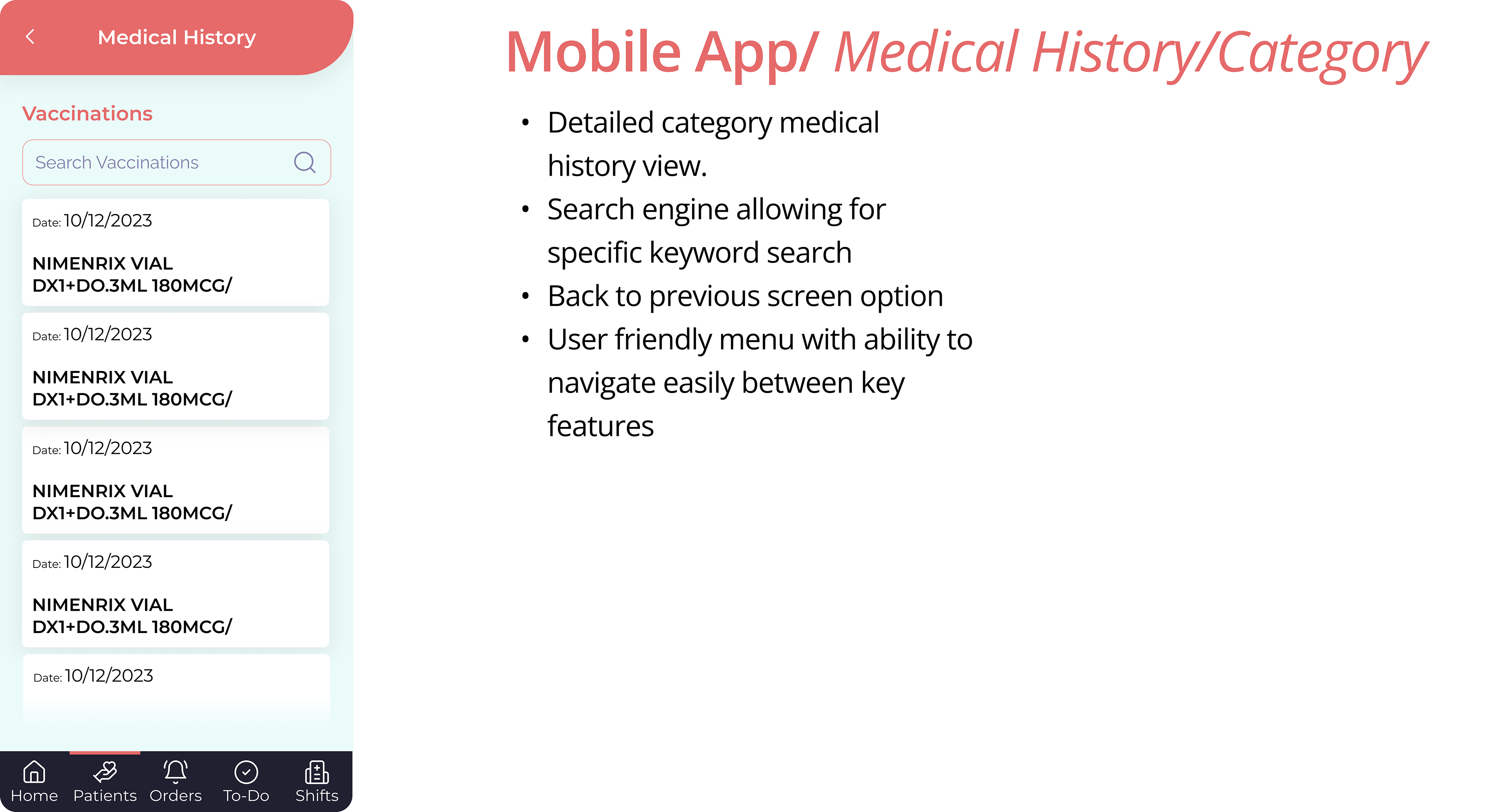
Desktop Screens
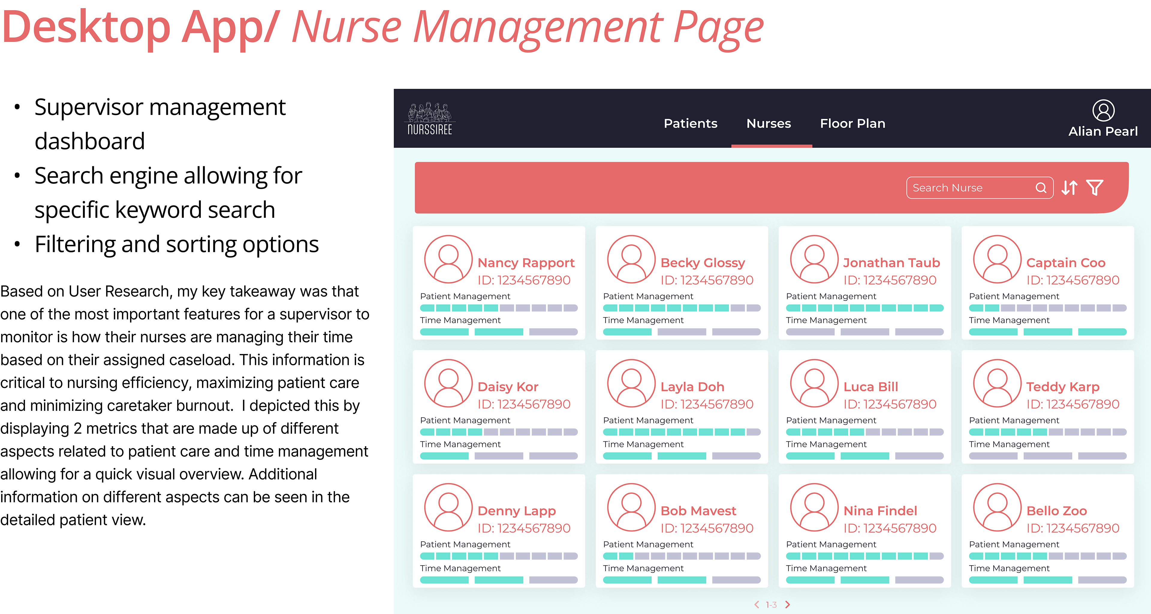
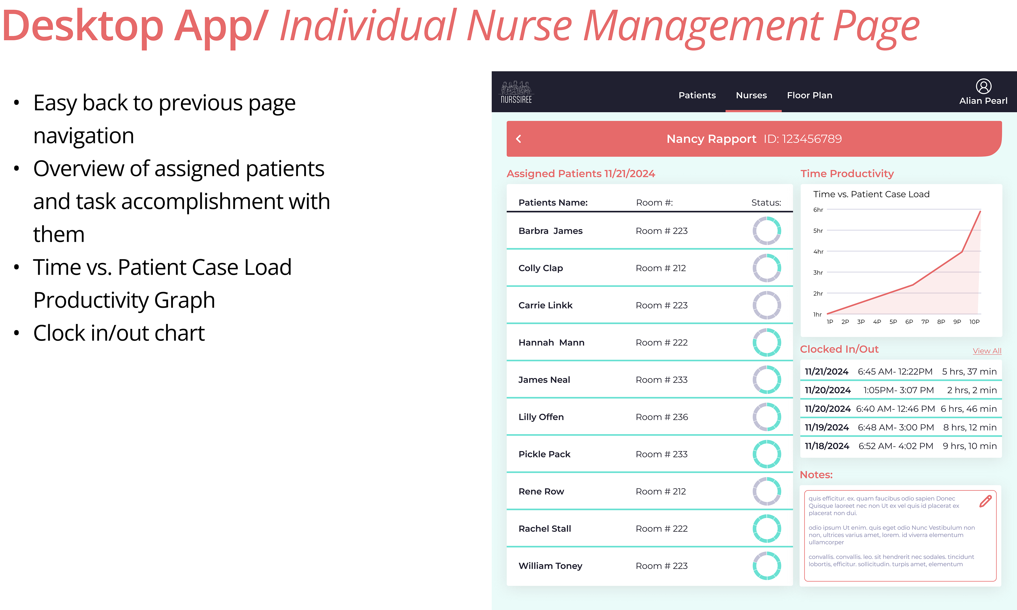
Although the timeline for this project was brief, I thoroughly enjoyed putting my all into it! Despite the limitations to my research given the time constraints, I feel like I was sufficiently able to empathize with the User Needs and goals coming up with an initial game plan to address the defined problem. Having done numerous projects, I must say that I think this application is my favorite UI to date. Had I had more time I would’ve really loved to expand on all aspects of this project; expanding my research to get a broader sense of more users, and expand my flows so I can really feel confident that I haven’t forgotten any details and obviously, by extension, complete my UI more comprehensively. I also wish I had more time to focus on the research and solution ideas for the dashboard since I gave more focus to the mobile application.
I would love to get feedback from users in the field to hear if I’ve managed to pull together a viable product.
I would love to get feedback from users in the field to hear if I’ve managed to pull together a viable product.
